Why "the simple web"?
The name "the simple web" was inspired by my fascination with simple solutions to complex problems. Engineers call it an elegant solution. As it applies to my work, I live for elegant solutions to complex programming and user interface problems. The simpler the better. The art and science of simplifying the UI and improving user experience is called usability.
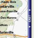 Recently I saw a wonderful example of usability in action in a couple of Google's projects. In particular, it was Google Maps that stood out to me as a perfect example of simplicity flying in the face of the status quo. What do I mean? Well, does anyone remember MapQuest or MapBlast and the arrows on the borders of their maps? Remember how you'd have to click those arrows and then wait while the entire page reloaded just so you could move the map by a few pixels? Then what did Google do? Their map just let you click and drag it wherever you wanted. Pretty simple and intuitive huh? Well, why hadn't anyone implemented it until then? The status quo is why.
A friend of mine who was studying psychology once told me that there was no such thing as a truly original thought. She said that all ideas were derived to a greater or lesser degree by some observation outside of ourselves. I think that this is more often than not the case in web design. Not that we don't have creative people in our midst. But for the most part we design on a pretty high level of thought which is based on some fundamental principles that are rarely brought into question. It's like walking onto a construction work site in order to build a house. You may have a pretty creative design for the building you're about to erect, but for the most part, you don't question the brick, mortar, steel and glass you'll be using. After all, a door is a door, and a floor is a floor. Right?
 Well, that's the reason why when one mapping company began to compete with the other, they both adopted the same form of navigation. The same can be said for web based email providers, portals, any site with top and side navigation bars, and the list goes on. The problem isn't that these are necessarily bad. The problem is that once a "standard" is established, everyone just sort of follows like a heard of sheep. Only once in a while does someone stand up and say, "Hey! I can do this better!" And of course, by better I mean simpler. After all, what's the most appealing feature of "innovative" technologies? Their simplification. You might be saying, "No, it's their increased speed, decreased size and increased power." But I submit to you that those are all means to an end and that end being an increased ease of use.
It's kind of like the 4-minute mile. Once the psychological barrier of "we can't do that" is broken, innovation flourishes until we hit another psychological plateau.
Well, that's my motivation. Breaking the psychological barriers surrounding web design. Questioning existing practices and not settling for the status quo. Don't get me wrong. Just because I want to question the norm doesn't mean I think myself capable of pioneering new paths in our profession. Then again, who knows. But you've got to start somewhere. Below is a three point summary of the simple web philosophy as I see it:
Recently I saw a wonderful example of usability in action in a couple of Google's projects. In particular, it was Google Maps that stood out to me as a perfect example of simplicity flying in the face of the status quo. What do I mean? Well, does anyone remember MapQuest or MapBlast and the arrows on the borders of their maps? Remember how you'd have to click those arrows and then wait while the entire page reloaded just so you could move the map by a few pixels? Then what did Google do? Their map just let you click and drag it wherever you wanted. Pretty simple and intuitive huh? Well, why hadn't anyone implemented it until then? The status quo is why.A friend of mine who was studying psychology once told me that there was no such thing as a truly original thought. She said that all ideas were derived to a greater or lesser degree by some observation outside of ourselves. I think that this is more often than not the case in web design. Not that we don't have creative people in our midst. But for the most part we design on a pretty high level of thought which is based on some fundamental principles that are rarely brought into question. It's like walking onto a construction work site in order to build a house. You may have a pretty creative design for the building you're about to erect, but for the most part, you don't question the brick, mortar, steel and glass you'll be using. After all, a door is a door, and a floor is a floor. Right?
Well, that's the reason why when one mapping company began to compete with the other, they both adopted the same form of navigation. The same can be said for web based email providers, portals, any site with top and side navigation bars, and the list goes on. The problem isn't that these are necessarily bad. The problem is that once a "standard" is established, everyone just sort of follows like a heard of sheep. Only once in a while does someone stand up and say, "Hey! I can do this better!" And of course, by better I mean simpler. After all, what's the most appealing feature of "innovative" technologies? Their simplification. You might be saying, "No, it's their increased speed, decreased size and increased power." But I submit to you that those are all means to an end and that end being an increased ease of use.It's kind of like the 4-minute mile. Once the psychological barrier of "we can't do that" is broken, innovation flourishes until we hit another psychological plateau.
Well, that's my motivation. Breaking the psychological barriers surrounding web design. Questioning existing practices and not settling for the status quo. Don't get me wrong. Just because I want to question the norm doesn't mean I think myself capable of pioneering new paths in our profession. Then again, who knows. But you've got to start somewhere. Below is a three point summary of the simple web philosophy as I see it:
- What & Why
- Determine the core need. What needs to be done and why? For example: the client doesn't need to proceed to the checkout page. The client needs to be able to buy your product. Identify the real need.
- How
- Ignoring established norms, determine the simplest, most intuitive method of addressing the need. For example: Click and drag the map in the direction you want to go.
- Get it done
- See if current or past solutions can be used or adapted to address the need. If not, start from scratch and make it happen. Just because it hasn't been done before, doesn't mean it can't be done. Innovate, innovate, innovate!


<< Home